Available for work
Based in NCR South, Philippines
River Flood Early Warning
A live flood early-warning platform for Sri Lanka — real-time river levels across major basins, alert thresholds, and charts, in three languages, built to be read in a hurry on a phone.
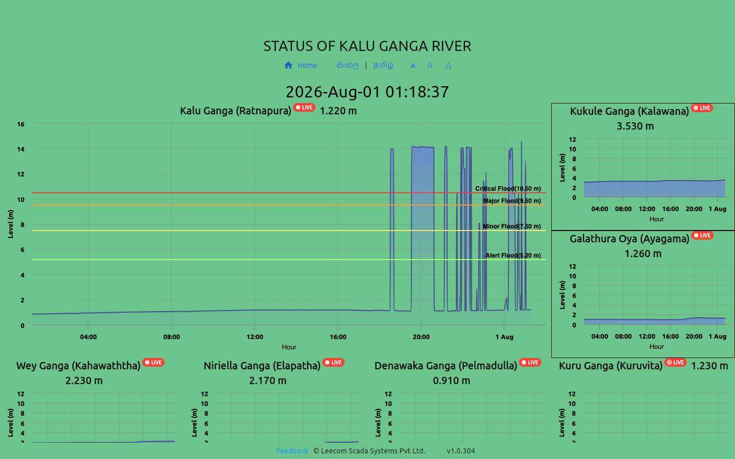
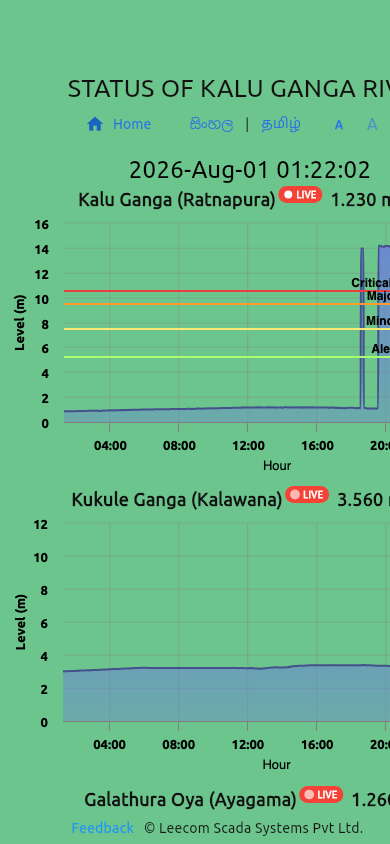
Sri Lanka floods regularly, and when it does, the information people need most — how high is the river near me, and is it rising — is scattered across government gauge readings that update in raw tabular form. There was no single place a resident, a journalist, or a local official could check river levels at a glance.
The stakes are not abstract: flood warnings reach people through word of mouth and social media, often too late and secondhand. The audience is everyone from disaster-management professionals to families deciding whether to move belongings upstairs — which means the platform had to work in Sinhala, Tamil, and English, and had to be legible to someone stressed, on a cheap phone, on a bad connection.
I built and maintain the platform end to end: the data pipeline that ingests public gauge readings, the map and chart interfaces, and the per-location pages covering major river basins including the Kelani, Kalu Ganga, and Nilwala.
Goals & Success Criteria
Success meant four things: river levels refresh frequently enough to be trusted during an active flood; every station shows its official alert status — normal, alert, minor flood, major flood — rather than a raw number the public can’t interpret; the full experience works in all three national languages; and any location is reachable by a direct, shareable link, because during a flood the site spreads through shared links, not navigation.
Approach & Key Decisions
Flutter Web over a JavaScript framework. I wanted one codebase that could ship to the web immediately and to Android and iOS later without a rewrite — for an early-warning tool, native push notifications are the obvious next step, and Flutter keeps that door open. The trade-off I accepted: a heavier initial payload and a canvas-rendered UI that search engines can’t read.
A crawler-readable shell around the canvas app. Because the Flutter canvas is invisible to search engines, I serve pre-rendered descriptive content — routes, capabilities, station coverage — in the HTML shell itself. Crawlers and link previews get real content; humans get the app. This recovered most of the SEO cost of the Flutter decision.
Highcharts through JS interop instead of a Dart charting library. Time-series flood data needs mature behavior — threshold bands, zooming, touch interaction — that Dart-native chart libraries handled poorly. Bridging to Highcharts cost interop complexity but bought charting that has survived a decade of production news and finance dashboards.
Alert levels as the primary UI, numbers second. A gauge reading of “7.2 m” means nothing to most people. Every surface leads with the official alert classification and its color, with the raw levels and history one tap deeper for those who want them.
Challenges
The upstream data is the hard part. Gauge readings come from public government sources that mix automated and manual measurements: stations drop out, readings arrive late, and formats shift without notice. The ingestion pipeline validates every reading against the station’s known ranges, marks stale data as stale instead of presenting it as current, and degrades gracefully when a station goes silent — during a disaster, showing outdated data as fresh is worse than showing nothing.
The second challenge is that peak load arrives at the worst possible moment: traffic spikes exactly when a flood is happening and mobile networks are congested. Keeping the app usable on a weak connection drove aggressive caching of static assets and keeping the per-refresh data payload small.
Results & Impact
The platform is live and maintained, serving real-time levels and alert statuses for major basins island-wide in Sinhala, Tamil, and English, with shareable per-location pages and historical charts. It turns raw government gauge tables into something a worried family can read in ten seconds — which is the entire point.
What I’d Do Differently
I would prototype the chart interop earlier. I assumed a Dart-native charting library would suffice and committed UI work around it before hitting its limits; the switch to Highcharts mid-build cost a rework that an early spike would have avoided.